

Watercolor workshop at the Botanical Garden of Valencia. July 2019
Travel Notebook is a proposal for lovers of travel, travels around the world and also journeys to our inner worlds, because in the end art is that, a journey inwards.
Now at the beginning of summer, when we take those days to disconnect, it's the best time to start a travel journal, or if not a travel journal, a summer journal, to have a good time during those days of rest.
On my travels, I try to carry a notebook and some art supplies—watercolors, ink, pencils, a marker or two—and I love it when, later on, I rediscover those hand-drawn mementos that transport me back to that time and place. I paint, I draw anything, from an insect to a figment of my imagination.
The travel journal also accepts words, thoughts, a travel journal accepts everything, different techniques or ways, it accepts self-portraits, portraits of friends or drawings of themselves, also landscapes and each of these pages becomes a captured experience.
Watercolor workshop diary.
DAY 1.
We will take a short tour of the botanical garden, gradually venturing deeper into it, learning some of its stories and anecdotes, visiting its greenhouses and delightful corners such as the aromatic plant garden, and finding a pleasant spot, perhaps sitting on the edge of one of its beautiful fountains drawing water lilies or on one of its wooden benches, trying to create a perspective on a tree-lined path.
This morning we had a fantastic watercolor session. The first painters, Victoria and M. Jesús, came, and we learned a bit more about color theory and graphic expression.

We practiced the color wheel exercise to learn about primary, secondary, and complementary colors. We did it in a unique way, not as a traditional circle, but by using color theory and watercolors and graphic techniques to make our exercise more expressive.
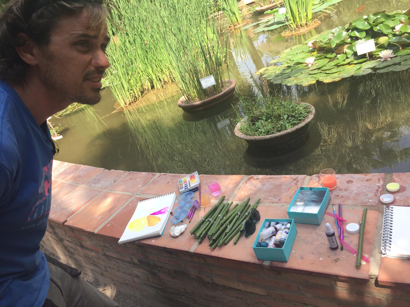
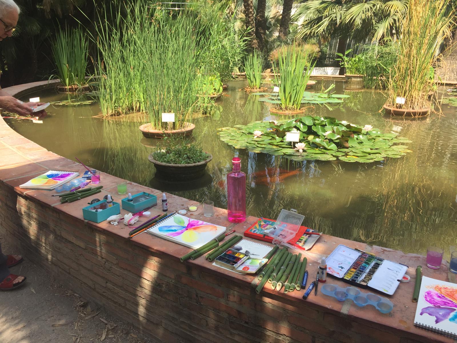
We were also lucky enough to find a very friendly gardener who cut us some bamboo prunings so we could make our own feathers. And we practiced with them today!.
DAY 2.
This Wednesday afternoon we are already more, MªCarmen, Clara, Fani, Jose Luis and Carmela joined our group of painters.
We'll do a free exercise to see how everyone experiences it, suggesting we use only two colors and then add another. Watercolor is about simplicity; it doesn't require many different colors, but within each mass of color, adding nuances with other tones is interesting.
Clara has given us this landscape.
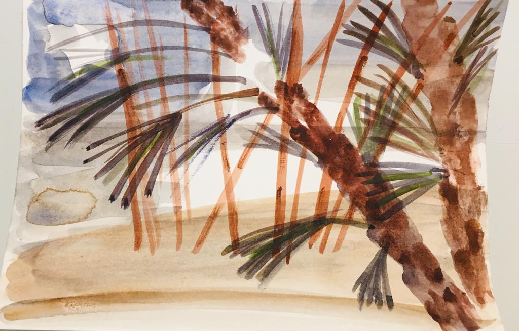
Those final greens were perfect for Clara's work; they were the finishing touch! The background lighting is excellent. It's a concise piece, capturing the essence, and the bamboo looks fantastic—subtle, transparent, and very expressive! The loose yet controlled brushstrokes stand out, giving the piece a rhythm. The textures of the palm tree trunks in the foreground are also very interesting, with layered brushstrokes and more saturated, and of course, warm colors. The chromatic perspective is very well applied, with the blues in the background. A controlled piece with a fresh result. Congratulations!
Jose Luis painted two beautiful watercolors.
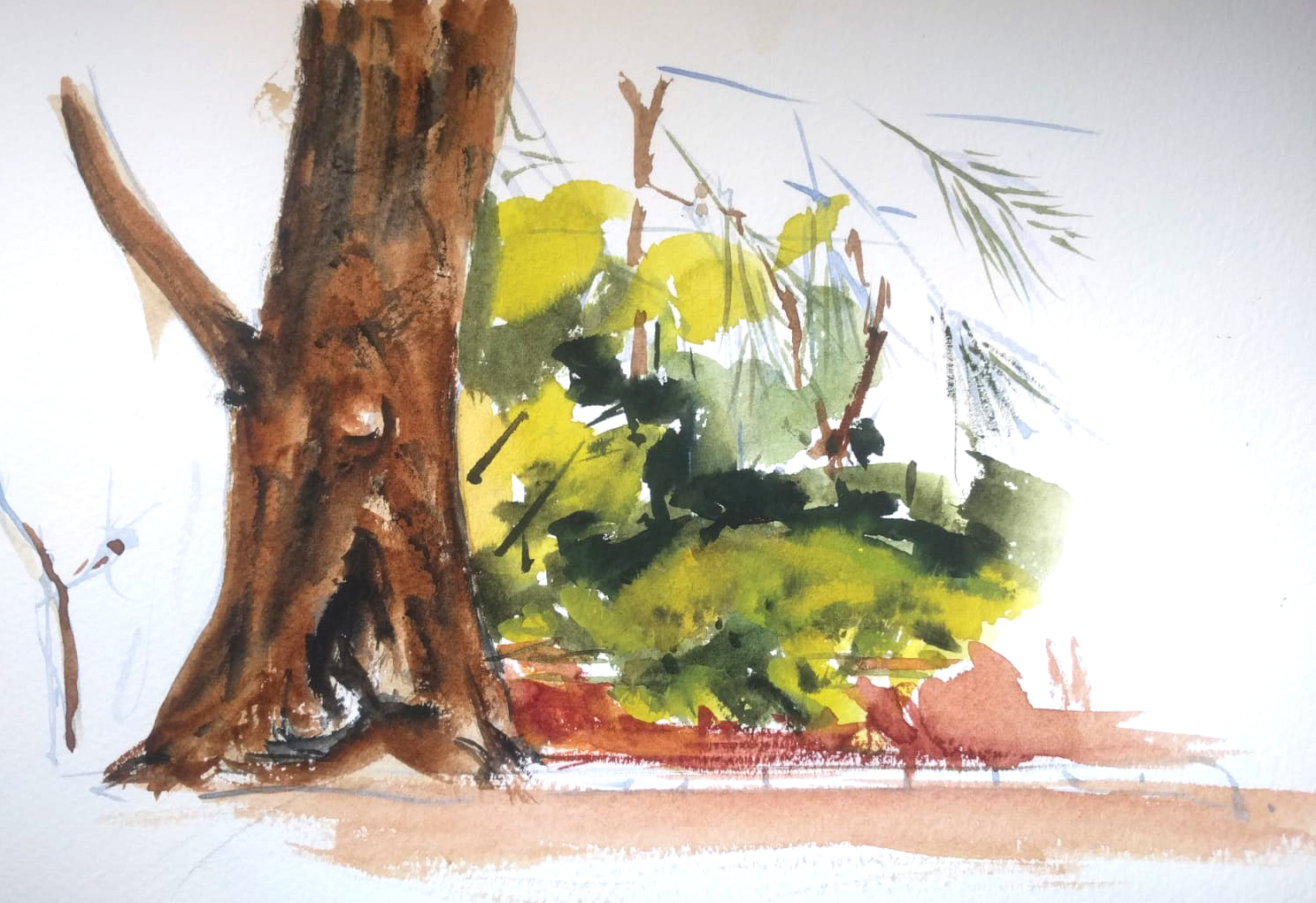
The composition stands out, emphasizing the foreground and downplaying the background. This is a good tactic, as the highly detailed areas of the background allow the lighter areas to breathe. The abstraction of the yellow patches and the delicate lines of the palm trees in the background are excellent, lending the composition a sense of movement and creating a feeling of atmosphere.
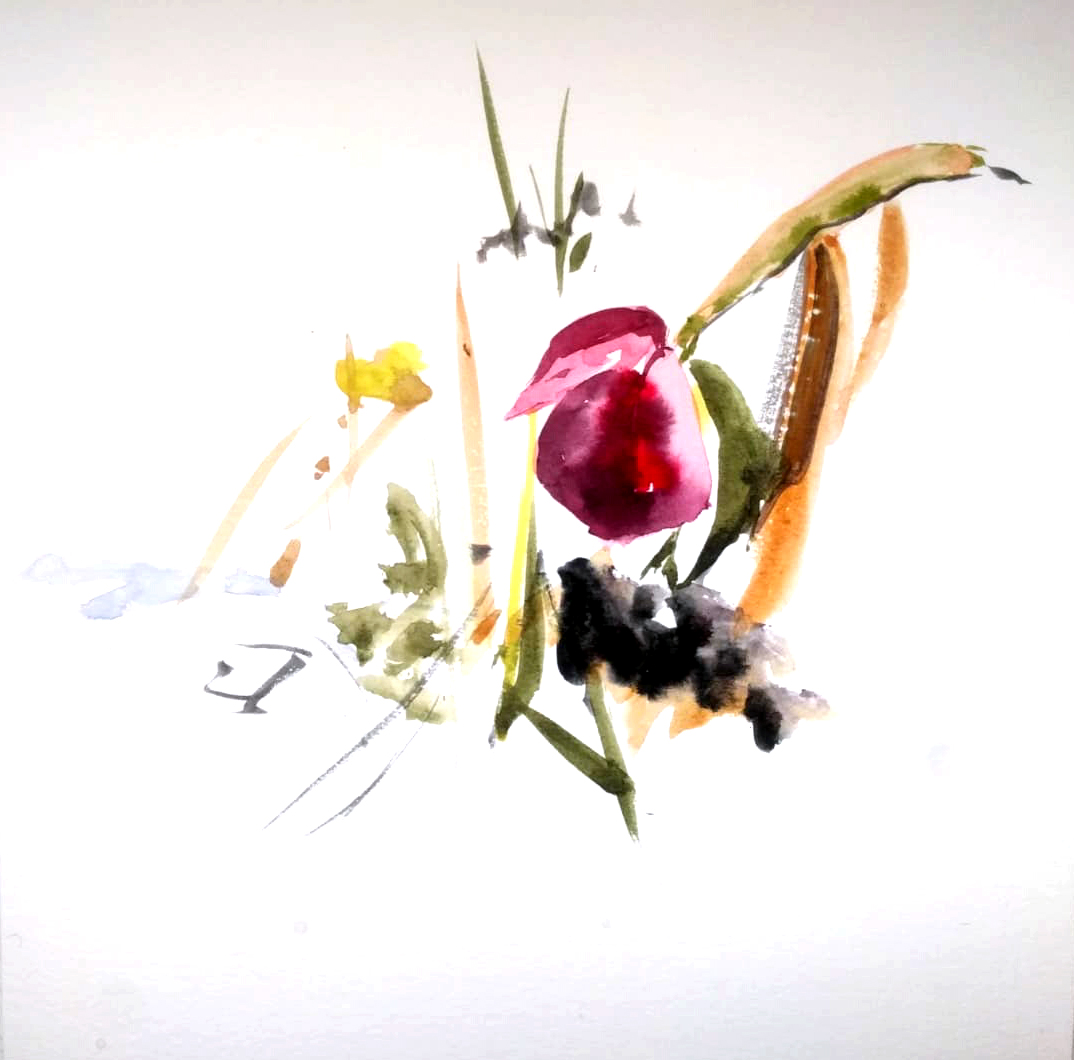
I love this abstraction by Jose Luis; it reminds me of the oriental painters I admire so much, and specifically the Chinese painter Zao Wou-Ki. We can appreciate that with just a few loose brushstrokes, with movement but deliberate, and a perfectly executed composition, with patches that balance it, he gives us a wonderful result.
Watercolor is a fresh and quick technique, and with just a few strokes we can achieve a magnificent result.
Carmela painted these two watercolors.
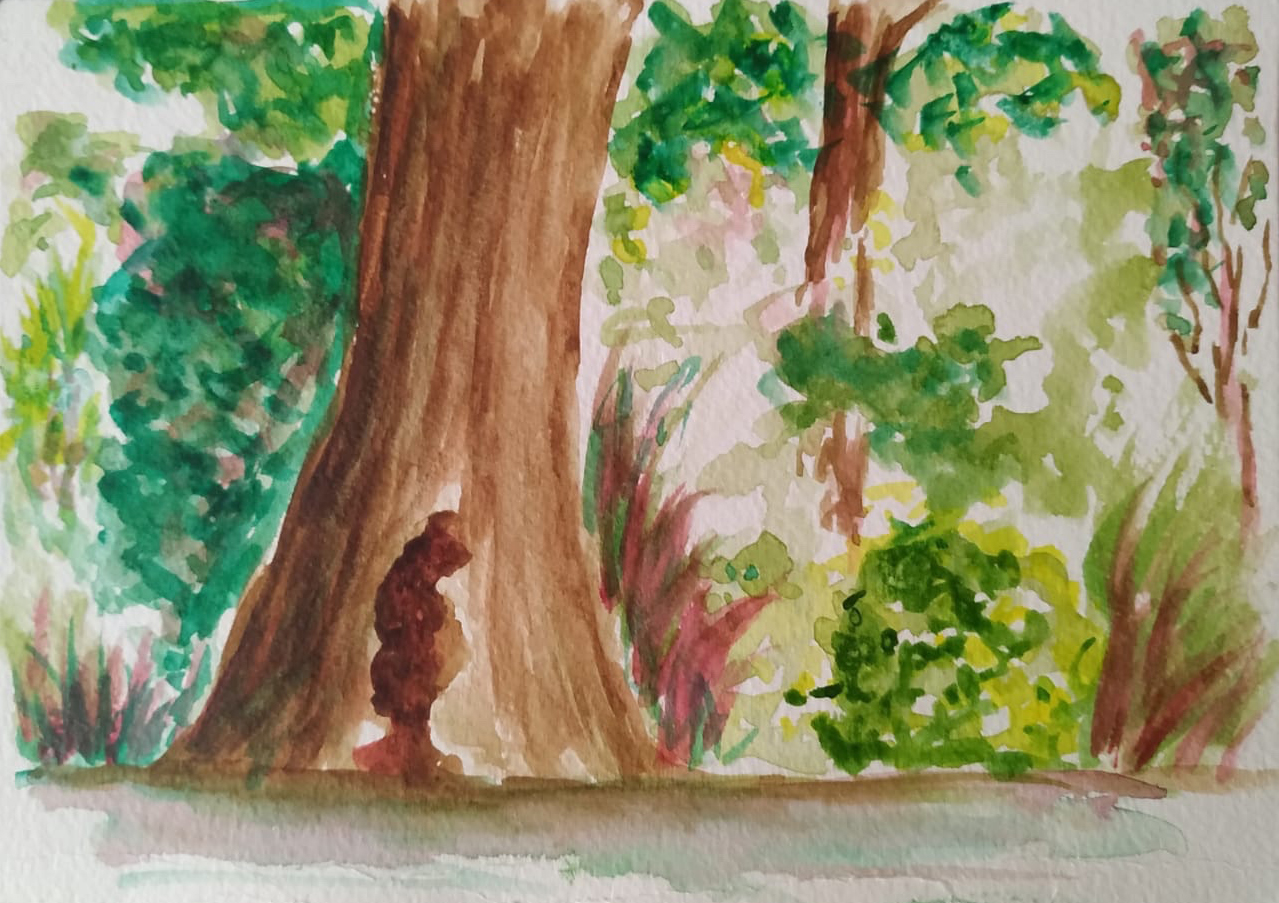
The backlighting is excellent, and the brushwork is loose. The more detailed trunk brings it closer to the foreground.
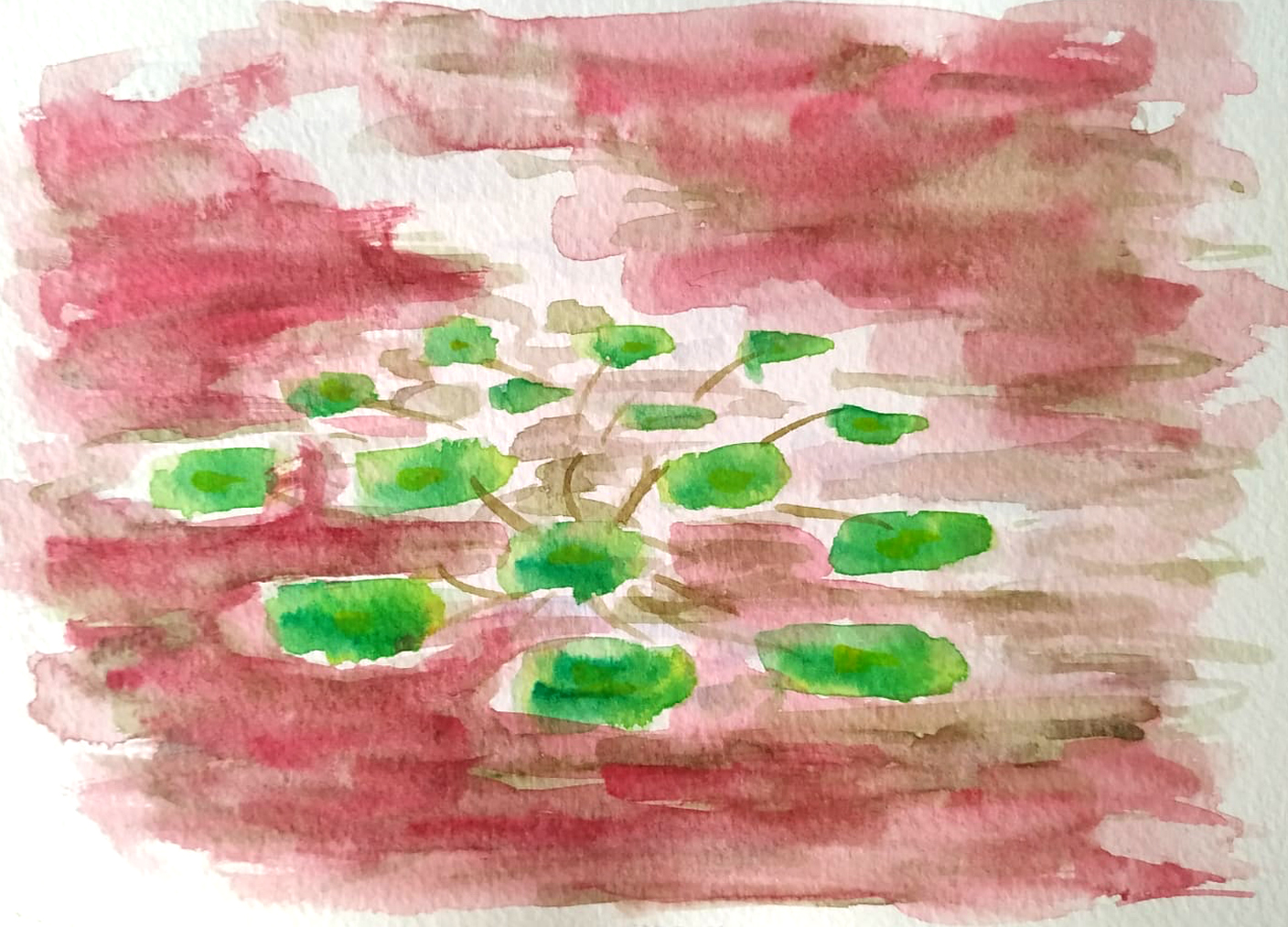
Carmela's first water lilies show us the work of the complementary colors. Perhaps the foreground patches should be slightly saturated to give a sense of depth, so the distant patches wouldn't be as prominent. Good work!
MªCarmen works with light in this group of leaves

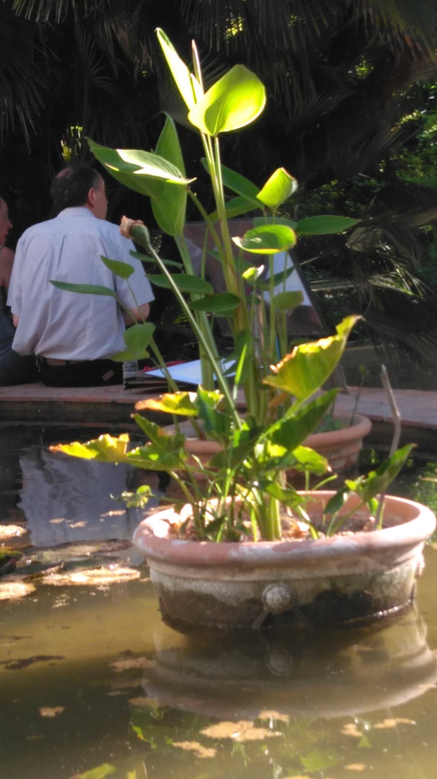
Delicate and expressive brushstrokes. Also a good composition of complementary magenta and green.
Here we have the watercolor result and the photographic reference.
DAY 3
It's a magnificent morning, Natasha Vasilyeva She's also with us, and from the shadows, with her wonderful vision, she's given us today's photos and also made this video. A million thanks, Natasha!

Today he joined our morning group Protection And with her loose brushstrokes, she begins to paint! Welcome, Amparo!

We see Amparo's finished work.
Good work with color and composition. Those aquatic greens are appropriate.
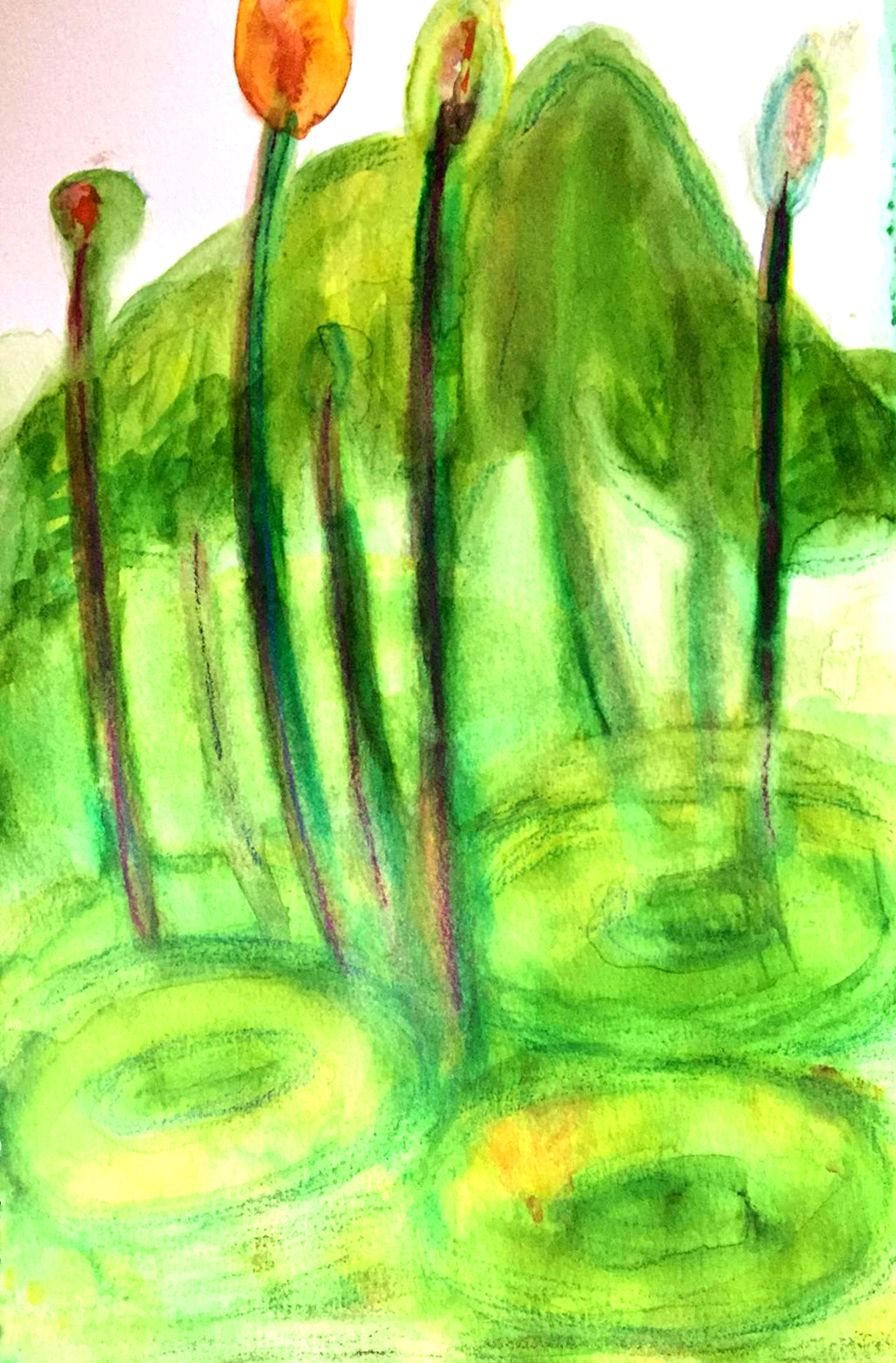
Empar M. On its first day, it starts with some somewhat vertical water lilies with expressive and suggestive spots.

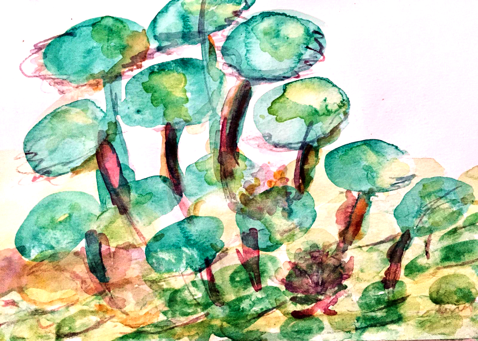
Of particular note are Empar M's fresh and loose brushstrokes in her second work

Here we see the result of Empar M.'s work.
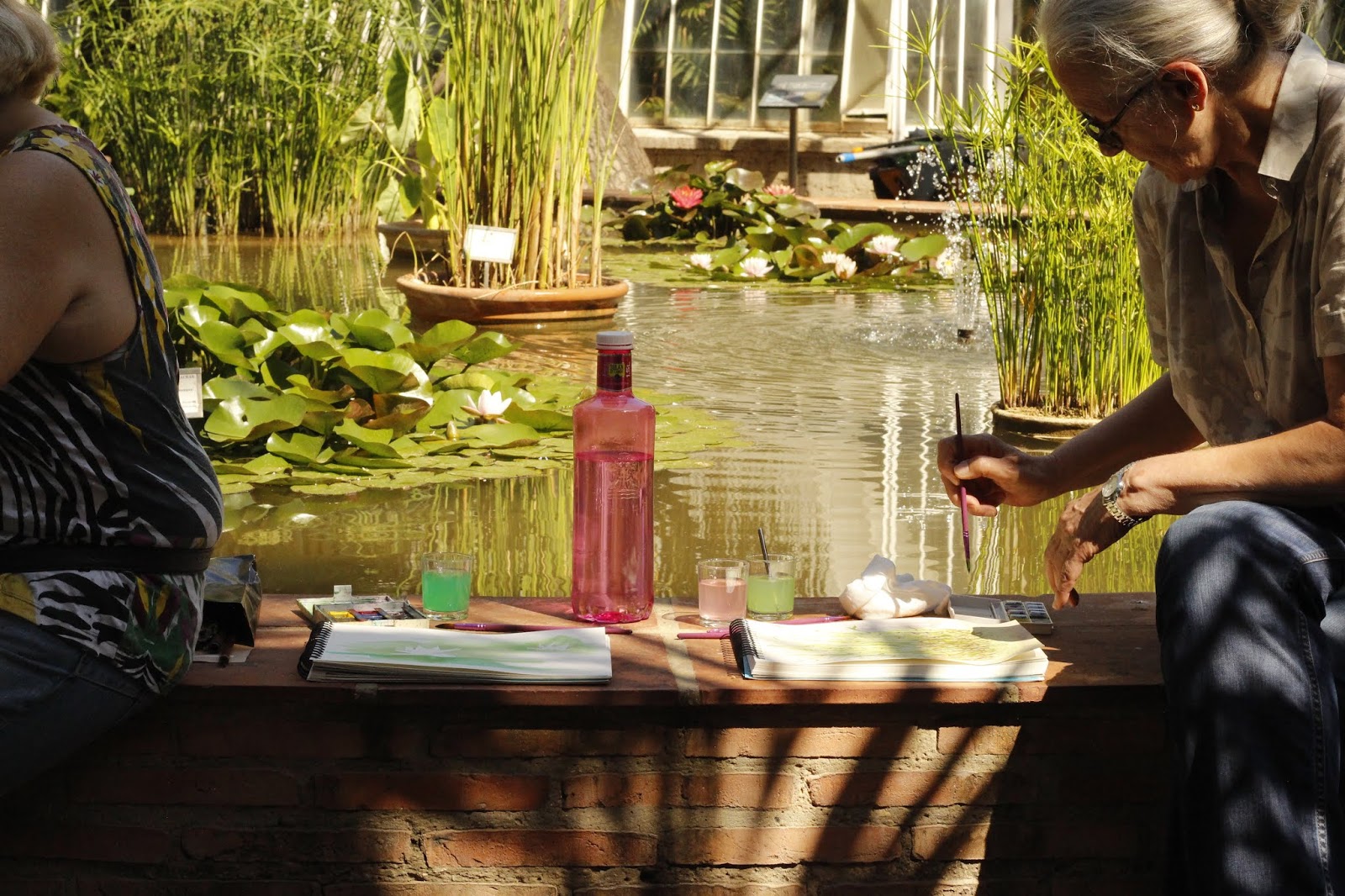
And here's a photo of these water lilies that inspire us so much

M. Jesus She is losing her shyness with color and brushstrokes, and even from the beginning with this technique, she is already seeing results.
Y Victory She's starting with experimental techniques, deciding to use one of the watercolor cleaning papers as a painting medium. Victoria, let us know how that experiment is turning out—I'm sure it'll be fantastic! We're open to everything in this workshop, but above all, we want to experiment and have fun!
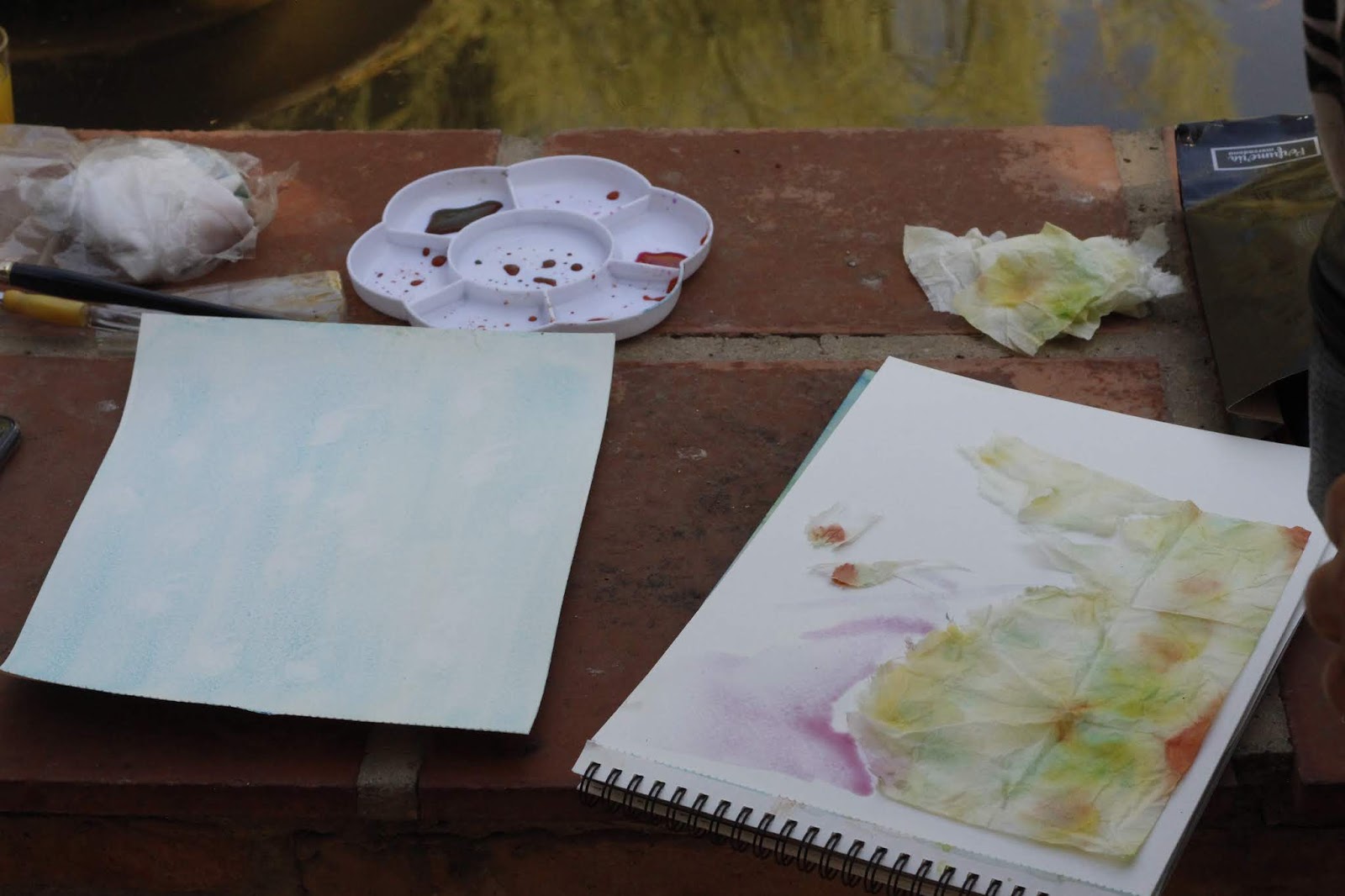
And yes, we enjoyed ourselves with this lovely group doing one of the things we love most: painting!

DAY 4.
This afternoon we changed location within the garden and positioned ourselves near the Umbracle, as it provides us with shade that refreshes us on this beautiful summer afternoon.
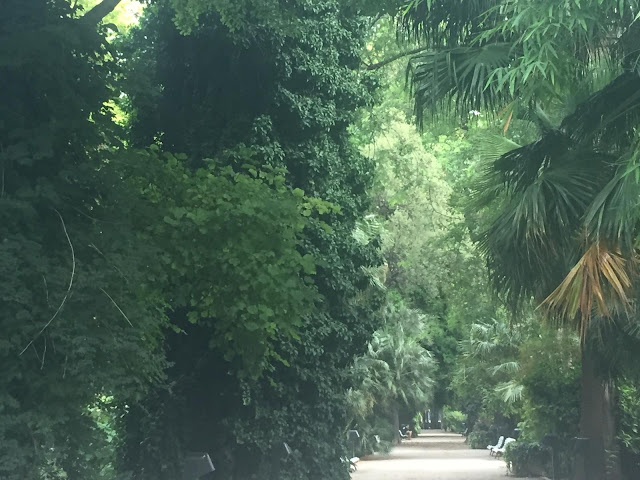
This landscape also offers us a broader perspective, bringing us closer to the concept of chromatic perspective. Here are some works from this afternoon's session:
Carmela The session began with this delicate watercolor, which could serve as an illustration for a porcelain piece. A simple work with a great result.
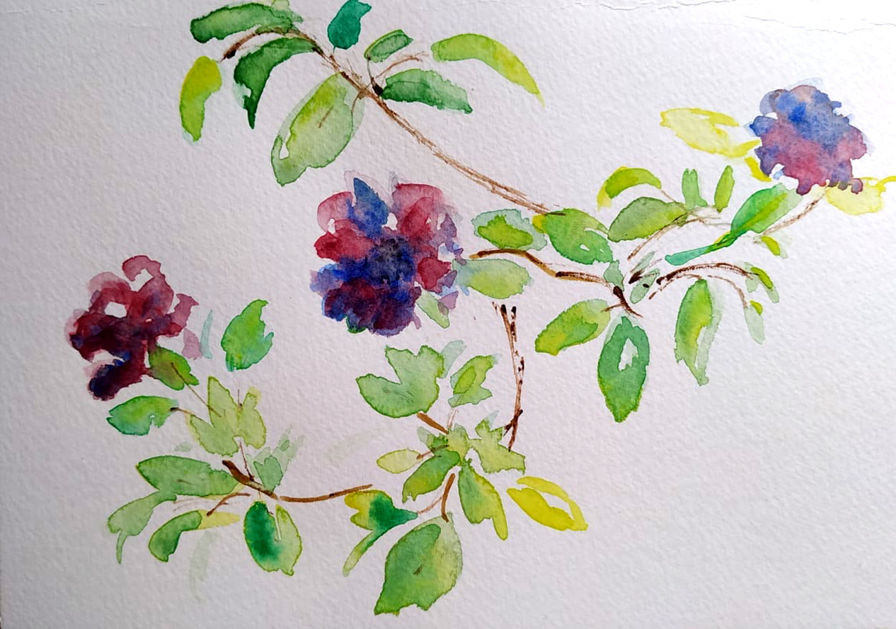
And as Carmela's second work, we already have a proper landscape:
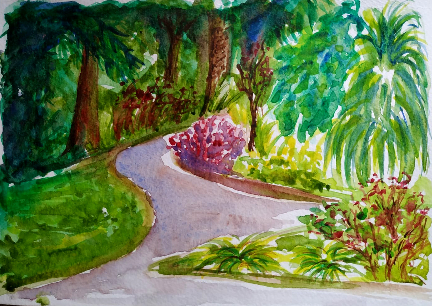
The abstract backgrounds stand out, suggesting that things are happening in the distance; a landscape exists, but it's not detailed, emphasizing the foreground planes through more detailed brushstrokes. The light from the palm trees also draws our gaze to the foreground. The cool colors in the background and the warm colors in the foreground create a sense of perspective—chromatic perspective.
MªCarmen He has also worked hard this session.
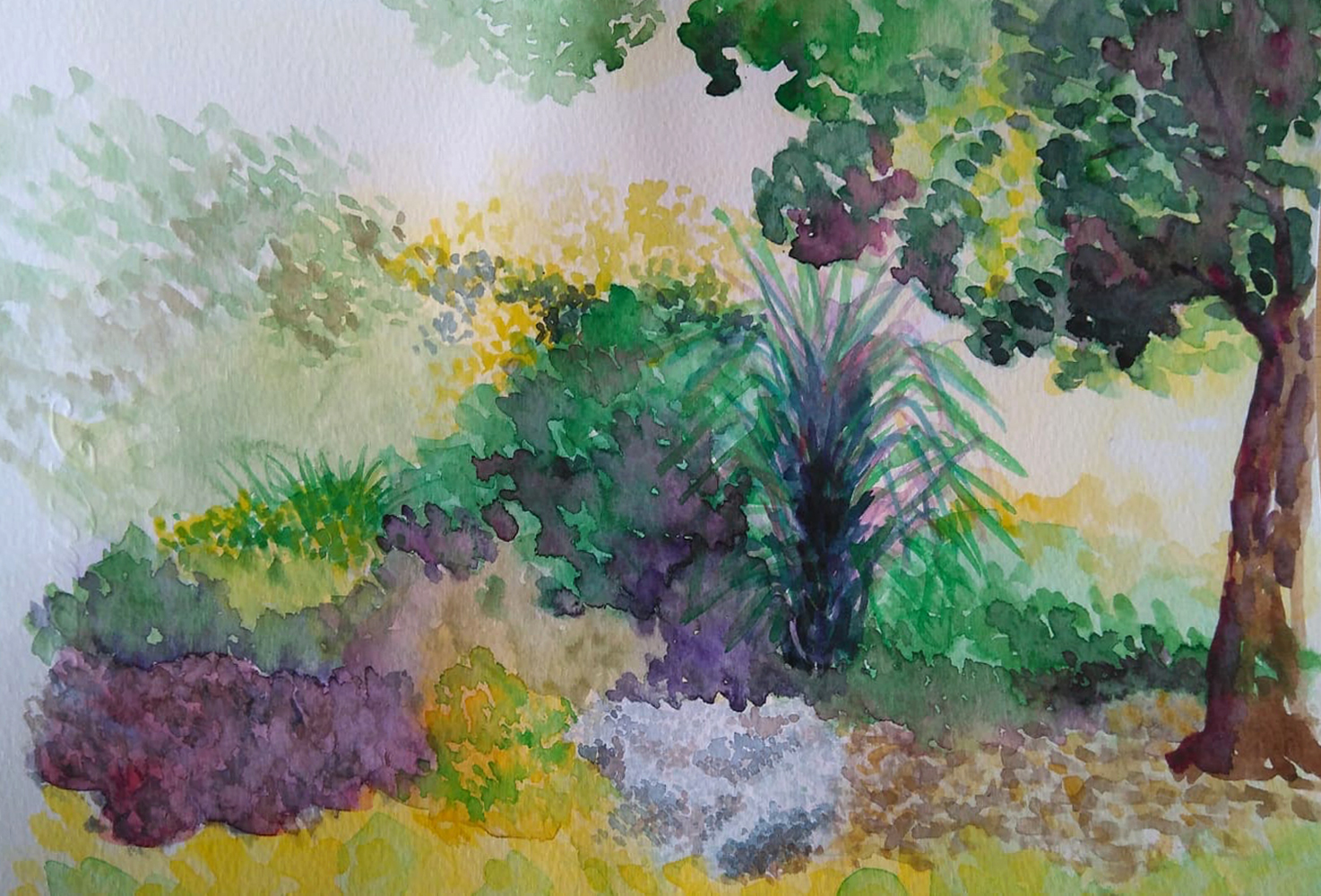
This watercolor is fantastic! The brushwork is effective, patiently applied in layers, with less saturated washes in the background. These areas are used to create luminosity, and the interplay of complementary colors (greens with magentas and violets with yellows) is beautifully achieved by working in masses of color. A truly beautiful piece!
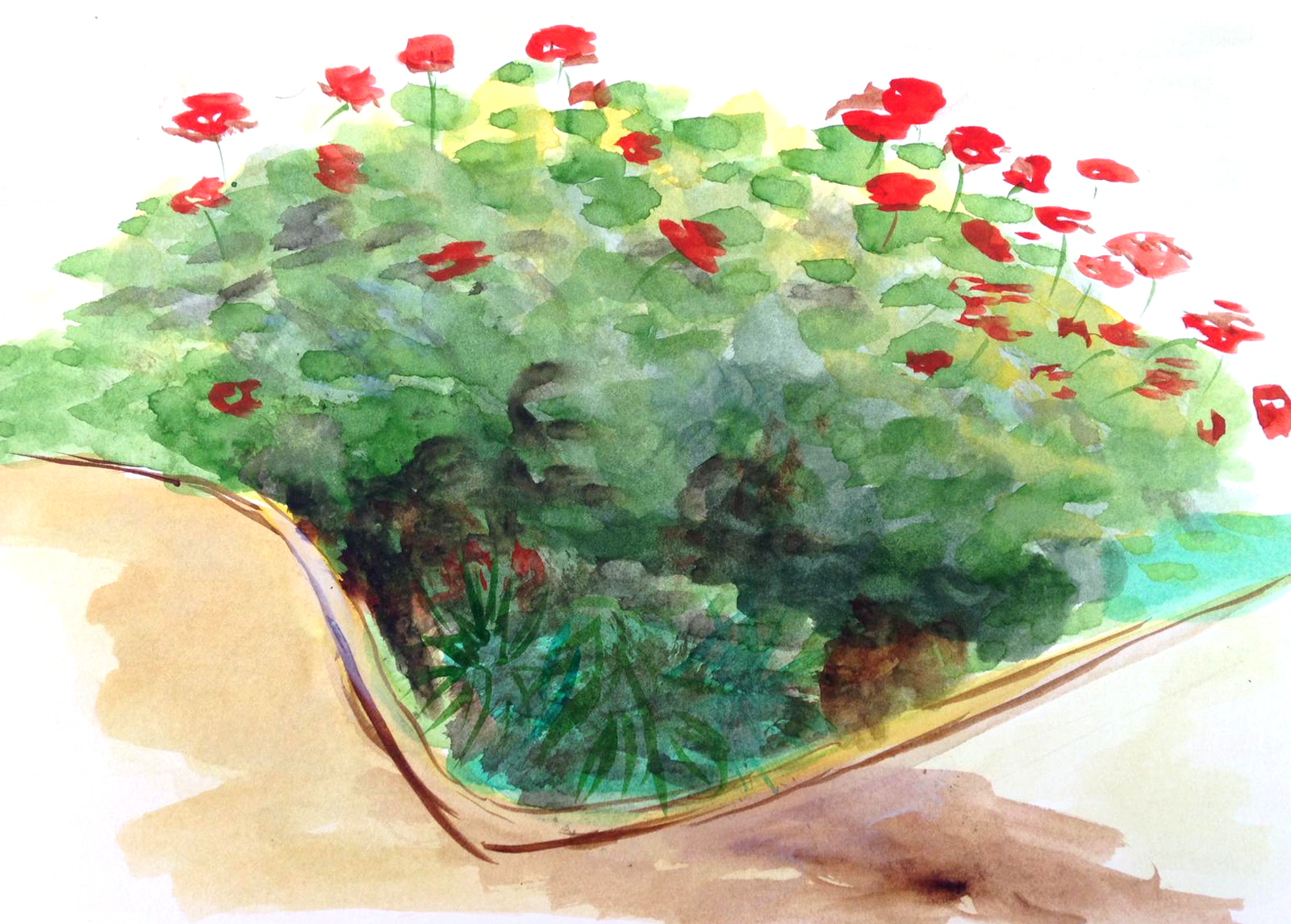
Protection She gave us these geraniums. We'll try to create shadows using complementary colors, as the colors come out more vibrant than if we apply black directly. If we want to create shadows of a particular color, we simply apply its complementary color over it, which will darken it. The complementary color is the sum of the other two colors on the color wheel, so, in the case of watercolor, we'll tend towards gray. (Remember that the sum of the three primary colors approaches black; in watercolor, because it's transparent, it approaches gray). I'll reiterate this and give another example: if I want to shade a yellow color, I'll apply its complementary color over it, in this case, violet, which is a secondary color because it results from mixing blue and red. Since the three primary colors are superimposed, we'd tend towards gray. By doing it this way, the shadows are more vibrant and blend better together.
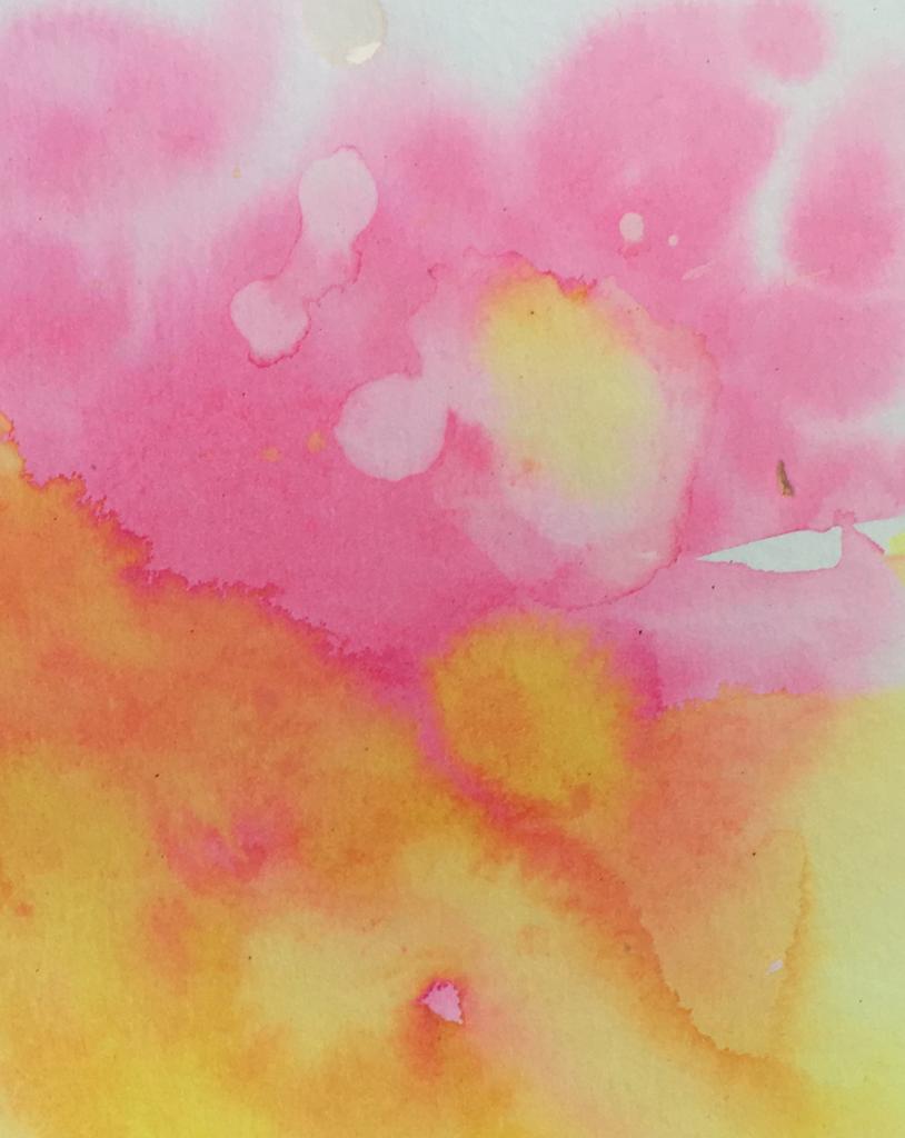
Y Clara She's also experimenting, this time with inks, as she's working on backgrounds for some illustrations. Here, she uses washes and plays with drips of water and color, applied with care and delicacy. For this type of work, the quality of the paper is also important; it should be absorbent, with a good amount of cotton in its composition. A sample of her work.
DAY 5.
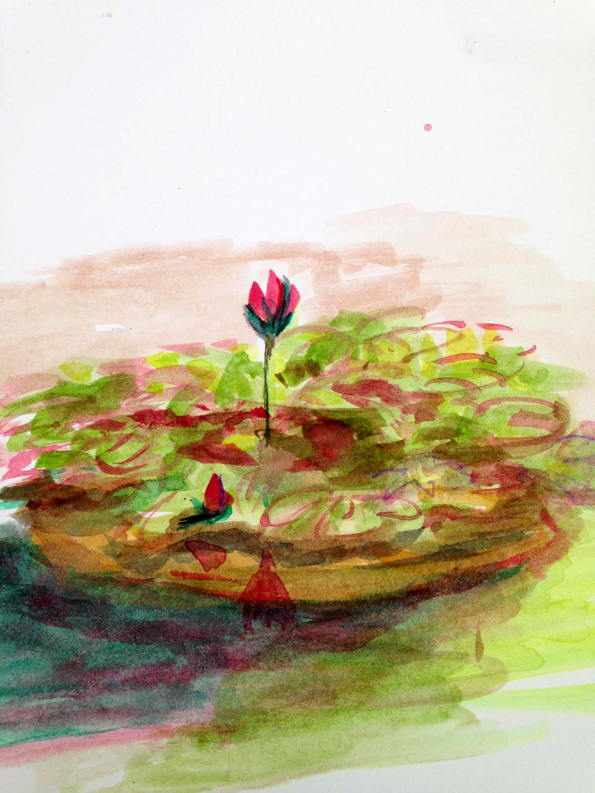
Today the absolute star of the day was the newly bloomed lotus, a live spectacle that we were lucky enough to appreciate.

It's a shame that this Nelumbo Nucifera only lasts a few days, and thanks to the photos of one of its gardeners and also the watercolors of our painters, this memory will be able to remain in time.
Here are some of our works. Empar M. With its delicate markings, it has captured this beautiful water lily for us:
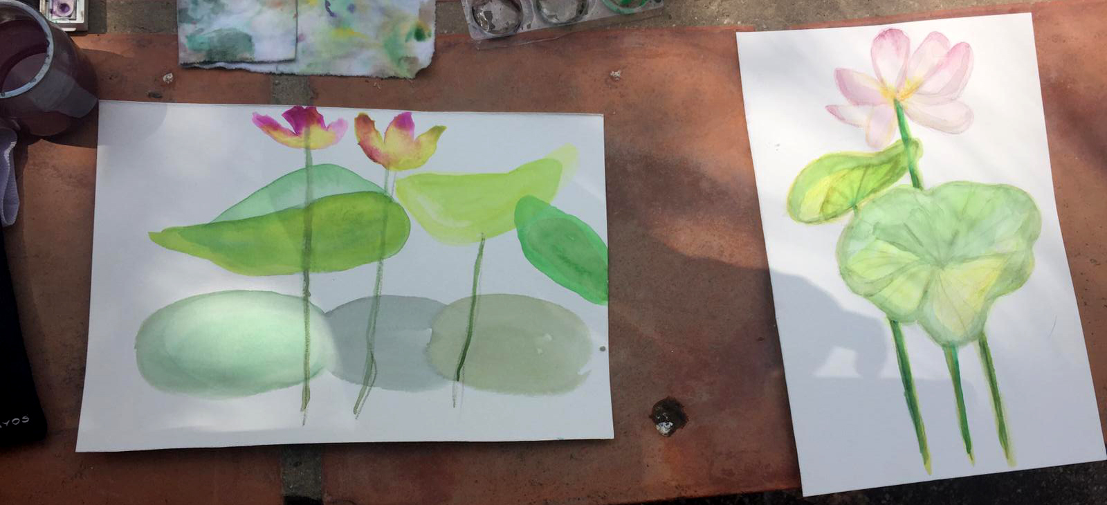
Also Protection She launched into these striking flowers. It was simply impossible to resist their charm.
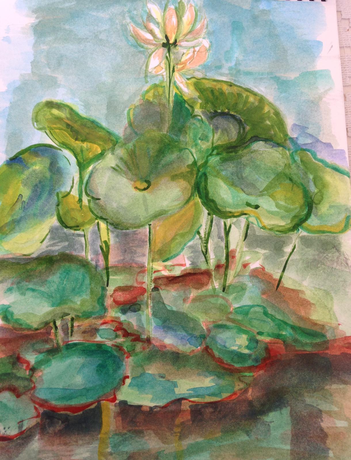
DAY 6.
Today, the sixth day of our workshop, we're enjoying a wonderful summer afternoon. The light and the lushness of the garden are refreshing and inspiring. We're gathered around L'Umbracle.
Here are the jobs:
Fani He has surprised us with this beautiful watercolor, where the freedom of the brushstroke and the abstraction of the stains are appreciated, as well as a delicate sense of color.
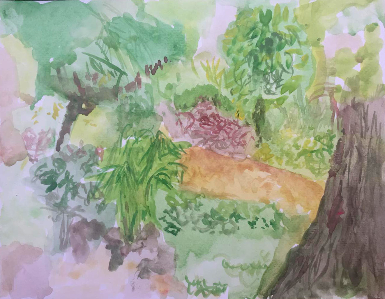
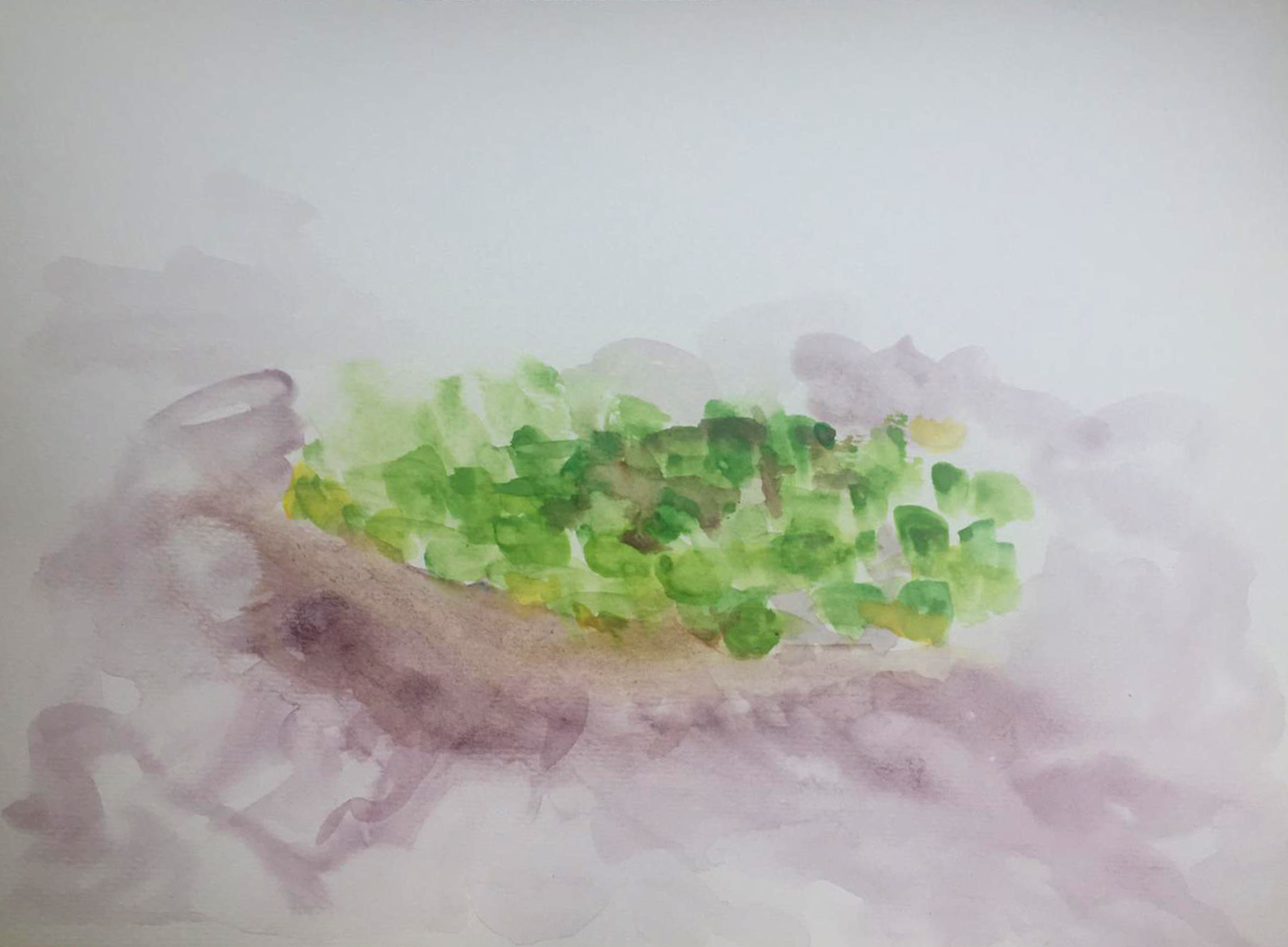
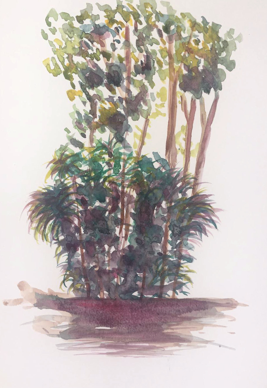
Carmela He dared to use these palm trees, which proved effective thanks to the interplay of complementary colors, reddish and green.
Jose Luis She created these interesting abstract washes in cool tones that make the orange frog-shaped patch stand out. As we can see, the warm tones against the cool ones give importance to the subject, visually bringing it to the forefront. Beautiful work!
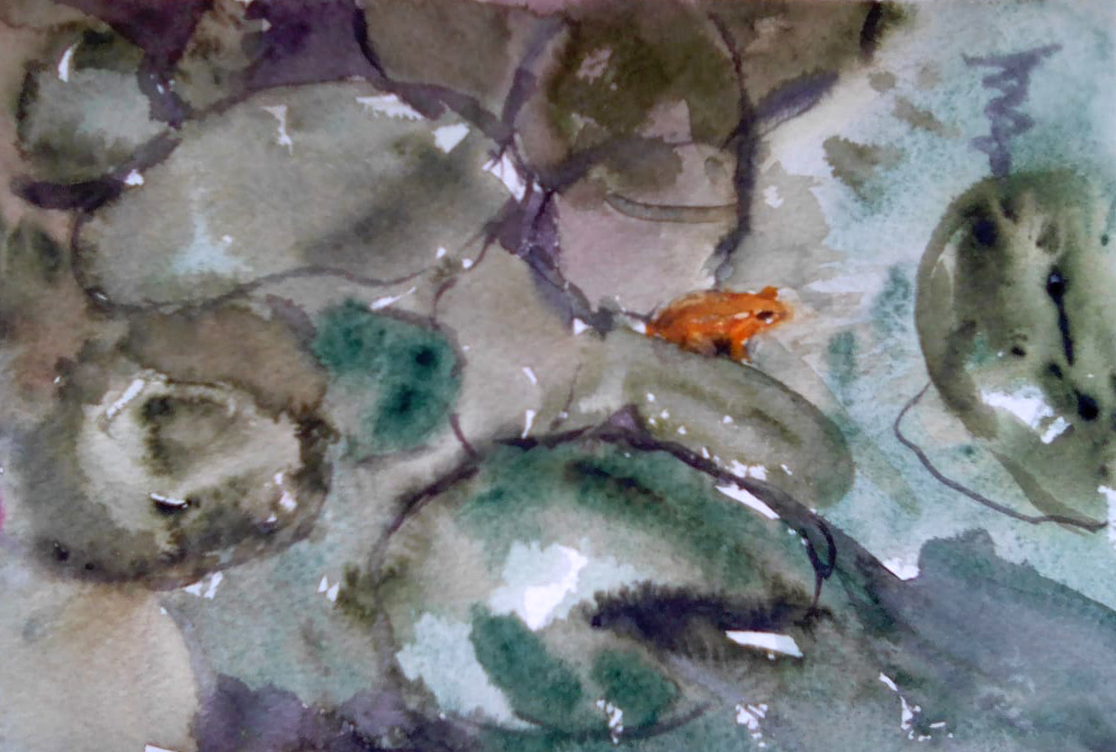
Protection With his characteristic loose brushstroke, he created a fresh and quick watercolor.

DAY 7
A wonderful morning at our beloved garden pool. That morning light is ideal for translating into chiaroscuro.
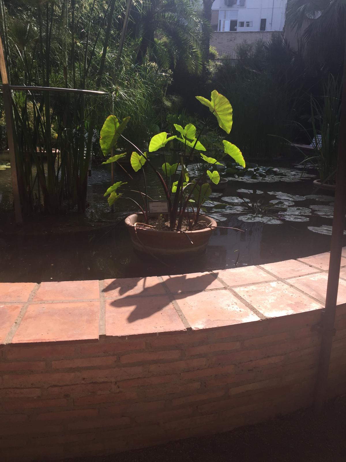
M. Jesus It has already been launched and it seems that its initial timidity with color is being left behind with these luminous yellow papyri.
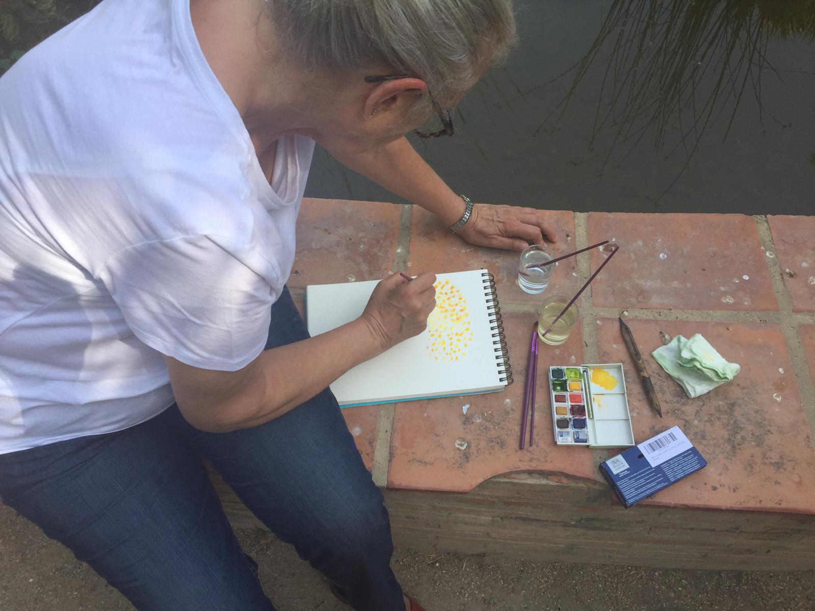
Pink He begins to experiment with washes; the first brushstrokes are trapped within the drawing, but he soon realizes that the drawing, rather than helping, hinders the expressiveness of the stains, and little by little he dares to use direct staining.

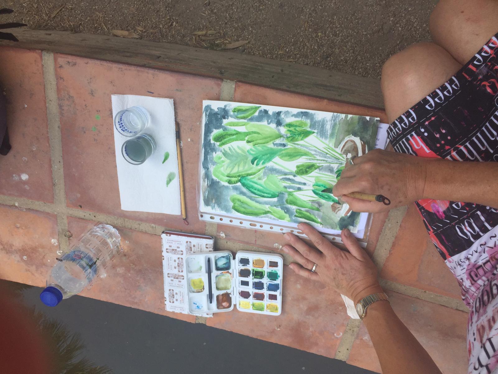
Y Protection He continues with his direct brushstroke, which comes from the Japanese sumi-e technique he learned, clearly applicable to watercolor.
DAY 8
We had a large turnout today.
They joined our group Patricia and his father August who dedicated themselves to painting palm tree trunks and other trees:
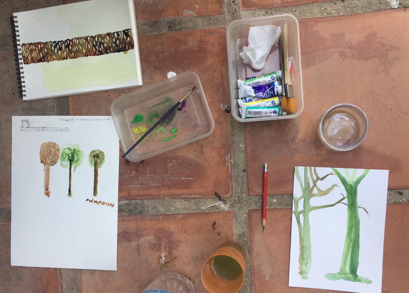
Y Jose Luis As always, he surprised us with his quick and effective brushstrokes in these two works where he explored chromatic perspective. We appreciate the cool colors in the background and the warm colors in the foreground.


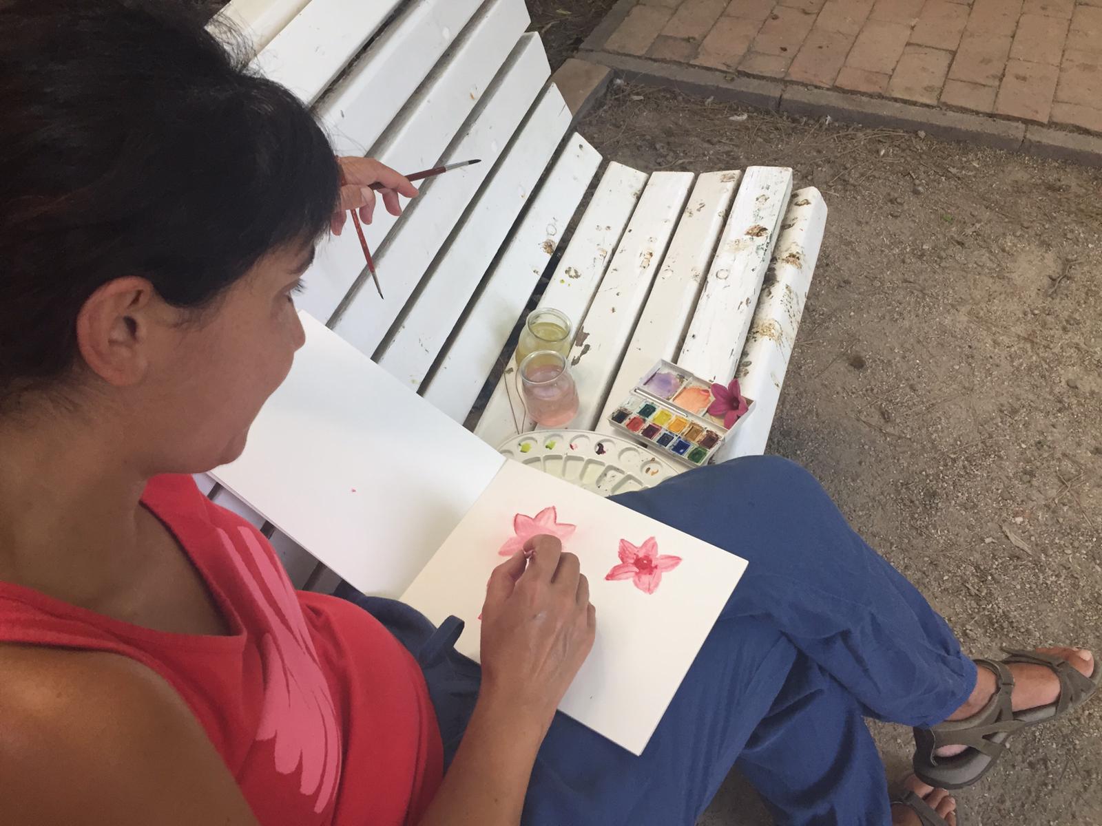
Pink She focused on the petals of a small flower, bringing out the depths and shadows, adding green to its complementary magenta. Good work.
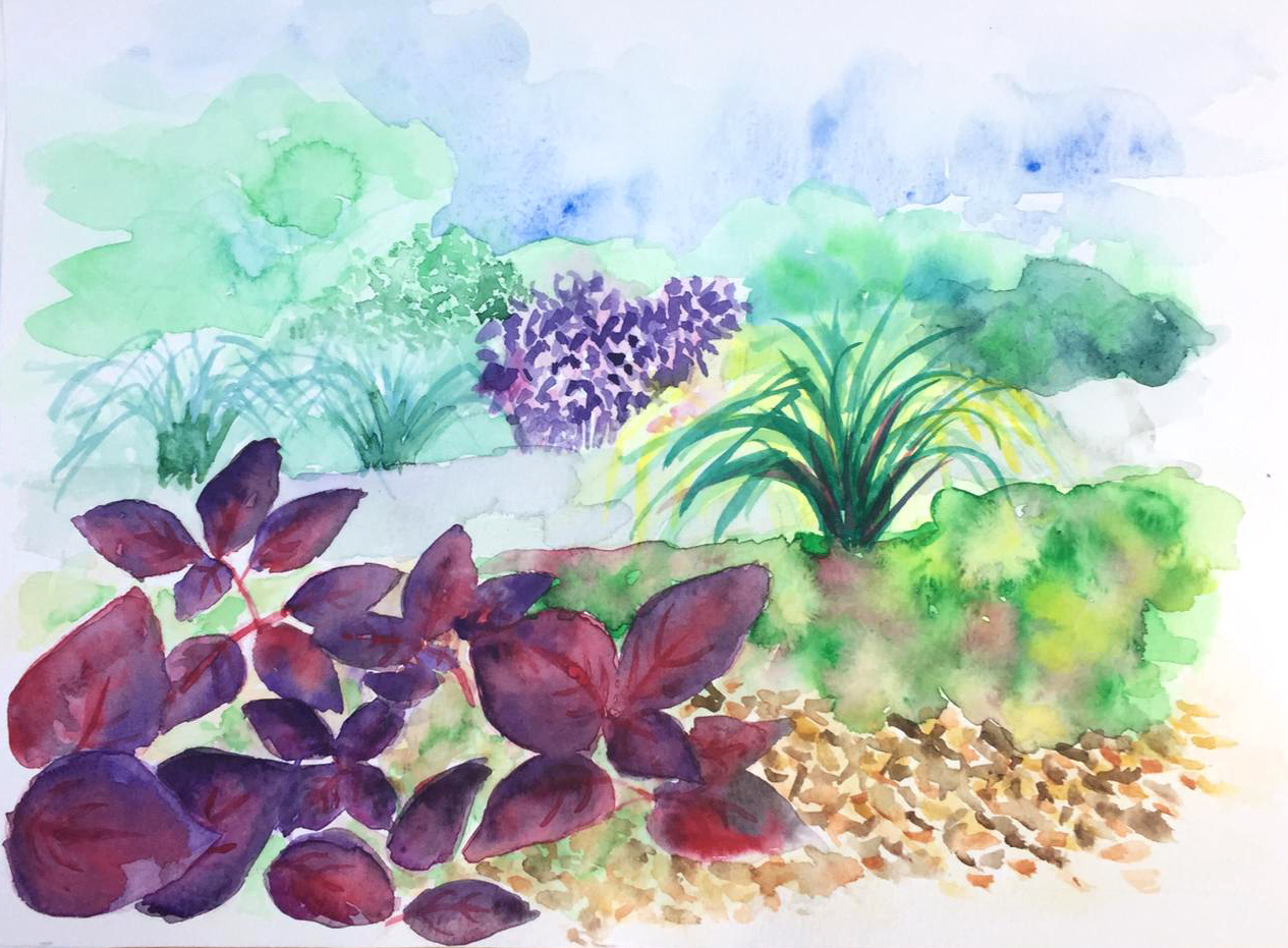
M. Carmen He finished the work from the previous session by defining the foreground with warm colors and with the most detailed brushstrokes, resulting in an interesting chromatic perspective.
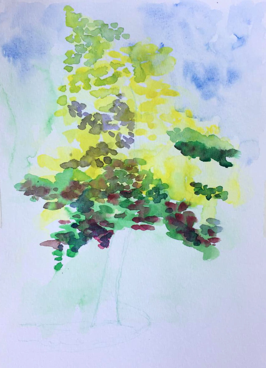
And she also started another watercolor of a tree, and we can already see the good result with that layered brushstroke that subtly defines the work:
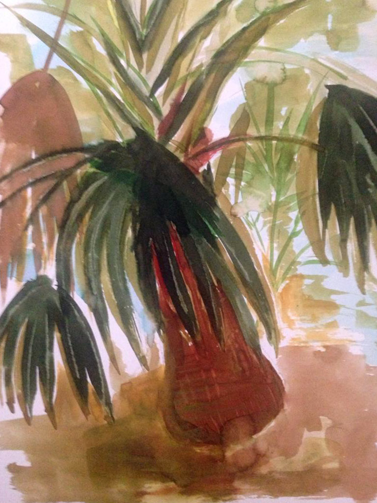
Protection She works quickly with that loose brushstroke. The light on the flowerpot is very well done.

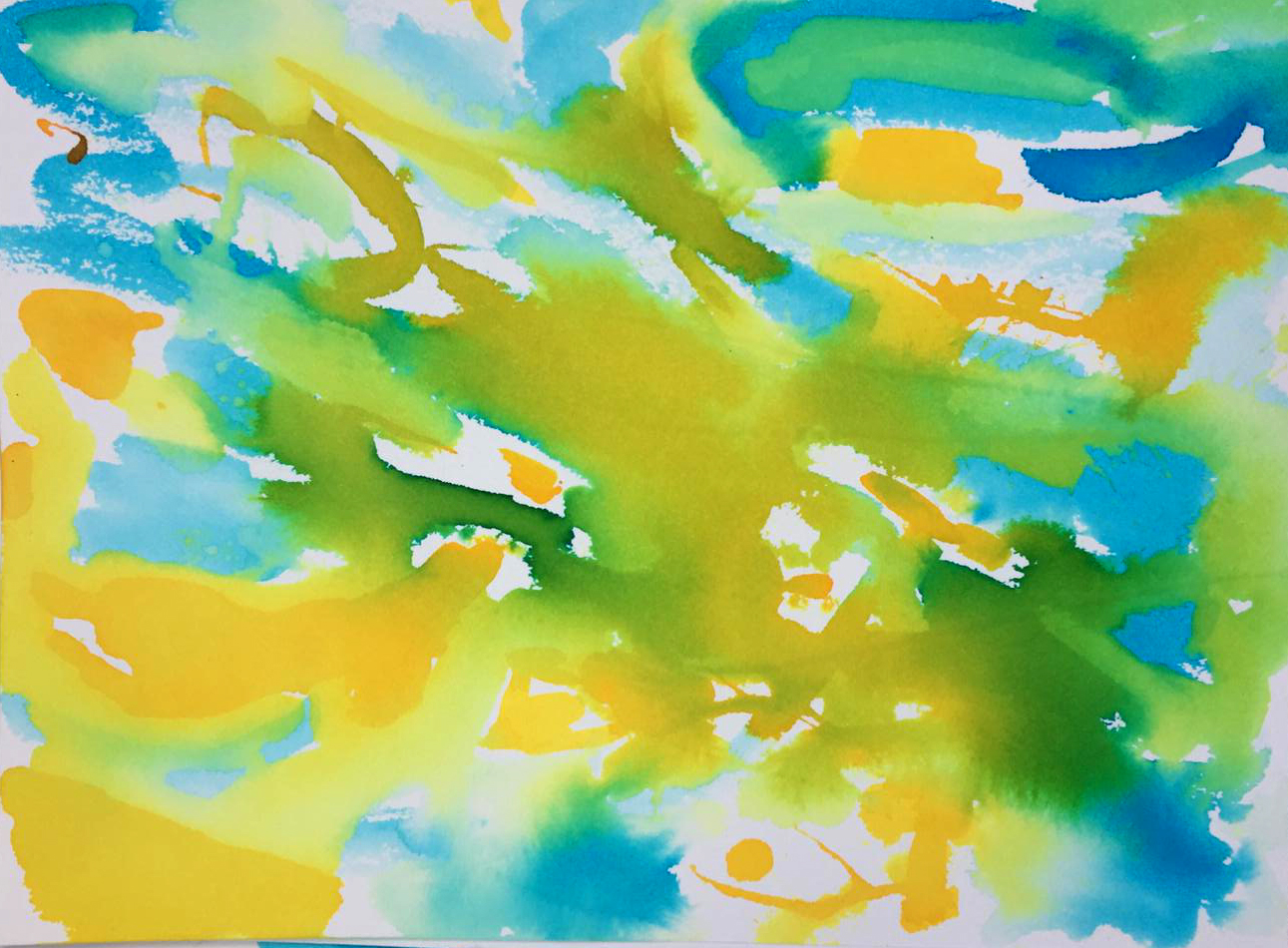
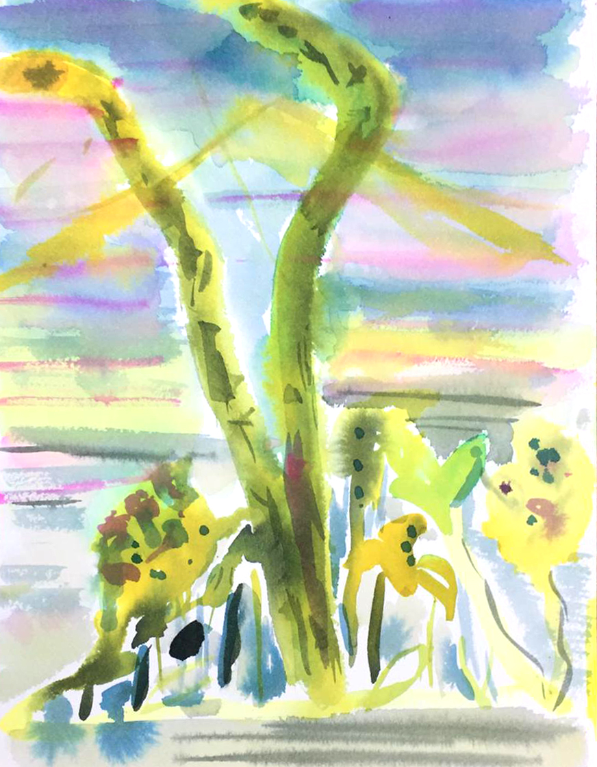
Y Victory She strives to create abstractions inspired by the light in the garden.
DAY 9
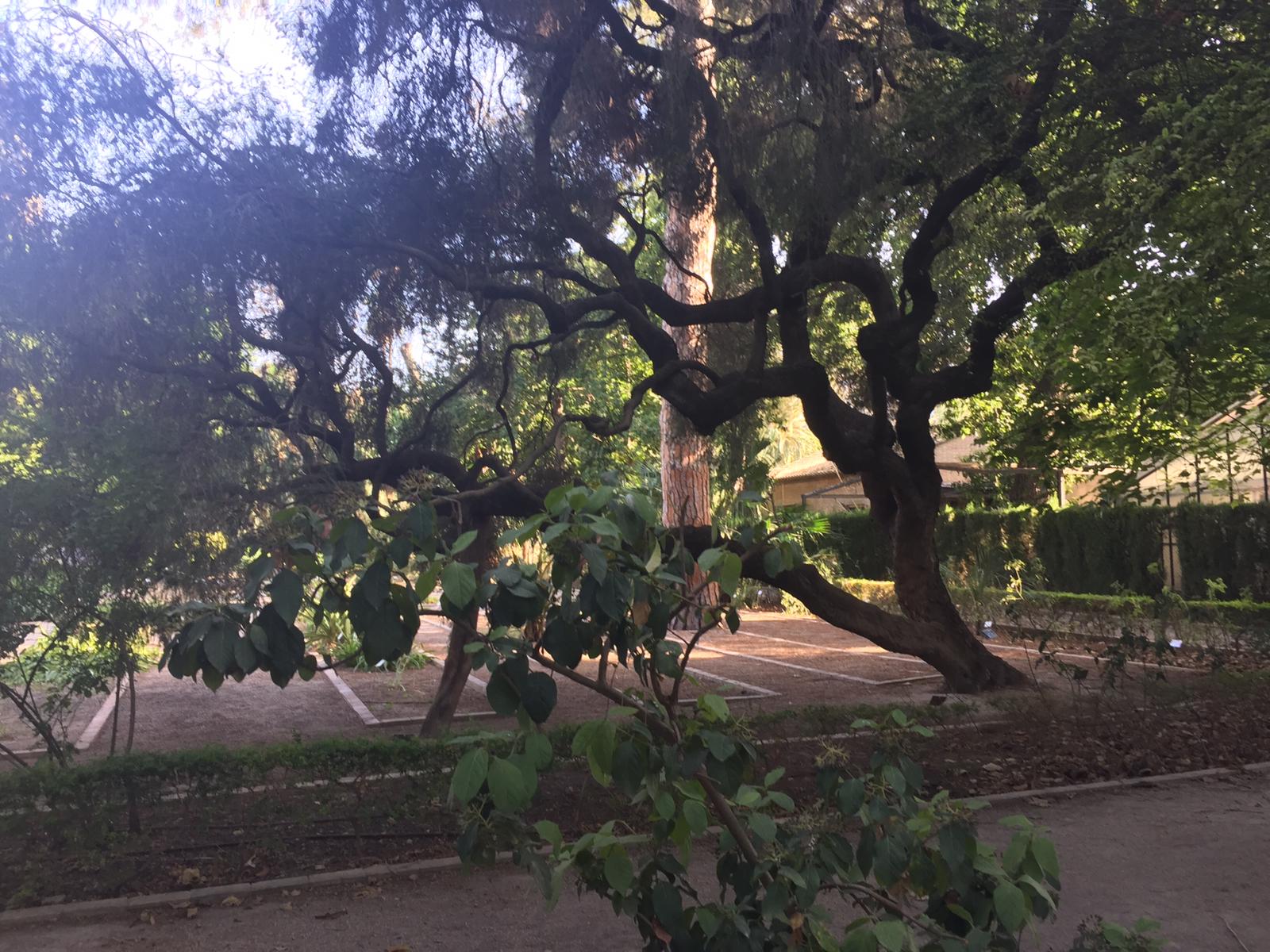
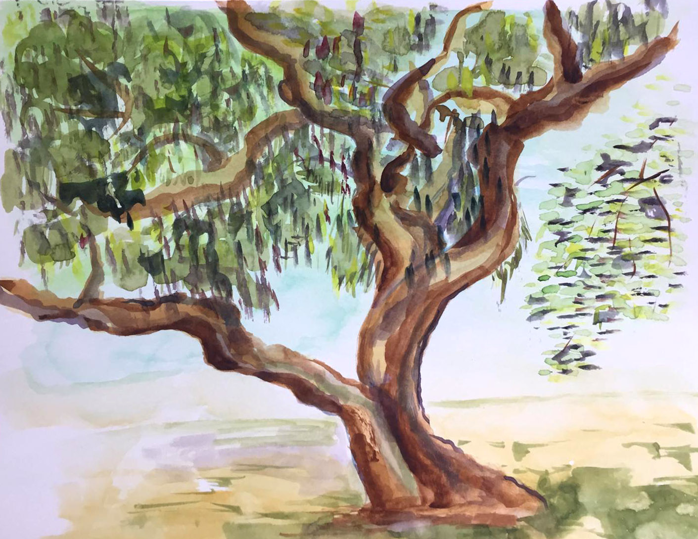
This twisted tree trunk is one of the most popular and inspiring motifs for our watercolorists on July afternoons. We have several versions like this one by Patricia.,
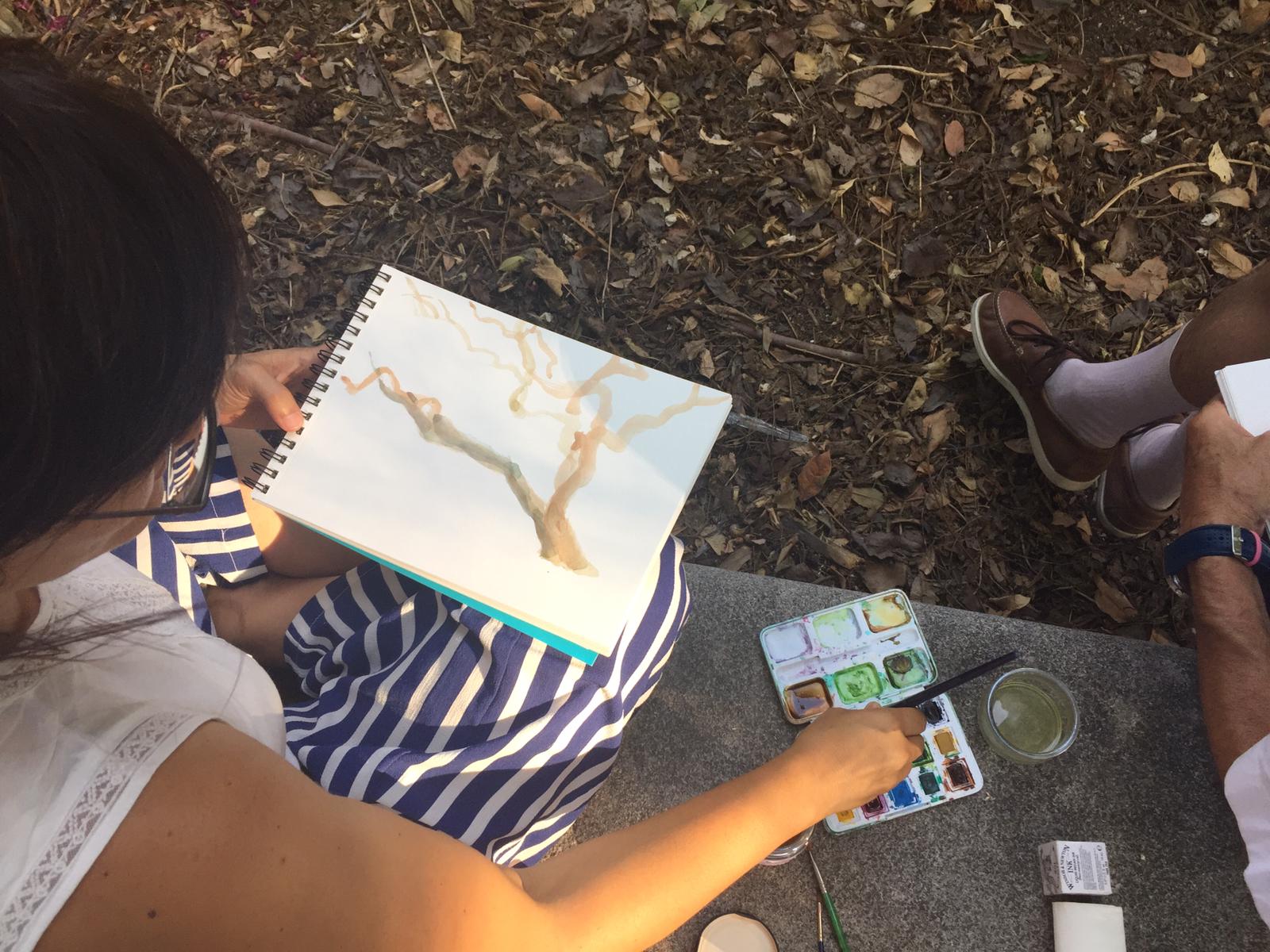
or the versions of Protection which on this occasion seems to abandon the loose brushstroke of sumi-e and delve into an analysis of color with a more controlled brushstroke.

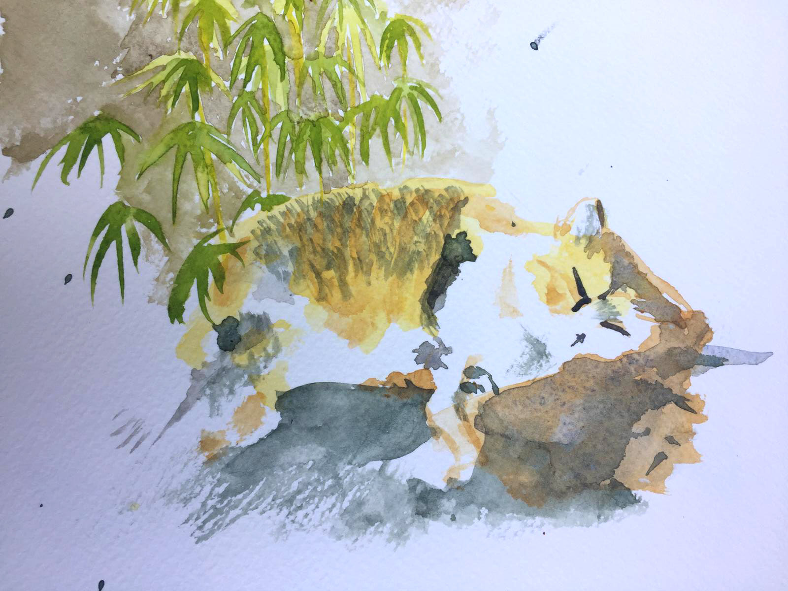
And here's the beautiful kitten she gave us Pink
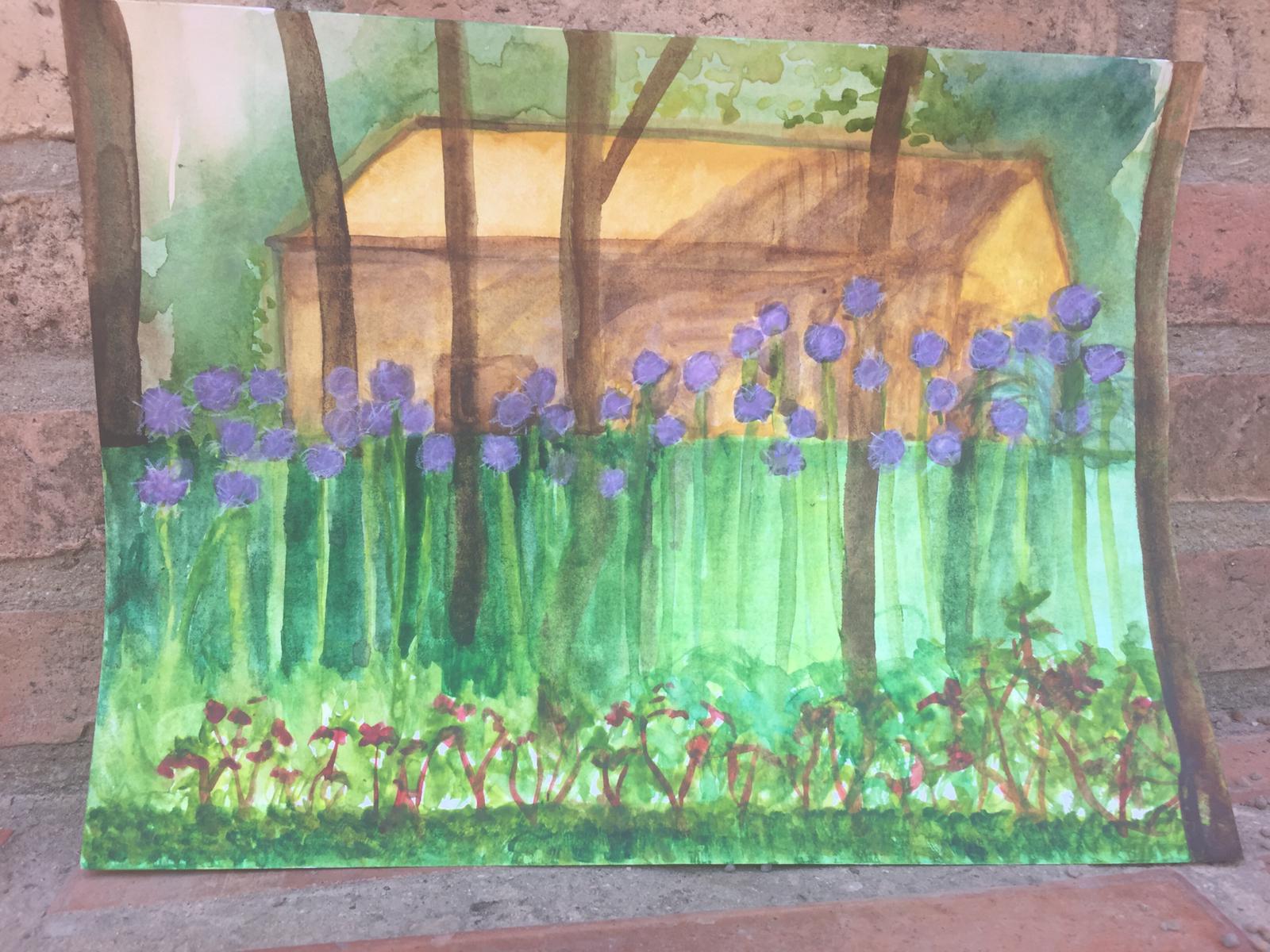
Y Dinah He worked with light and architectural drawing, and the result is this beautiful work.
DAY 10
This time, the area around the pool has been the inspiration for Protection, who continues to work with a fresh and loose brushstroke but reserving those spaces for light, so important to avoid saturating the works.

DAY 11
That beautiful Coleus plant has also been one of the most painted motifs; we saw it in a work by M. Carmen And now we can appreciate it in a work by Amparo in which the superimposed brushstroke leads us to her chromatic interpretation, which is quite accurate.
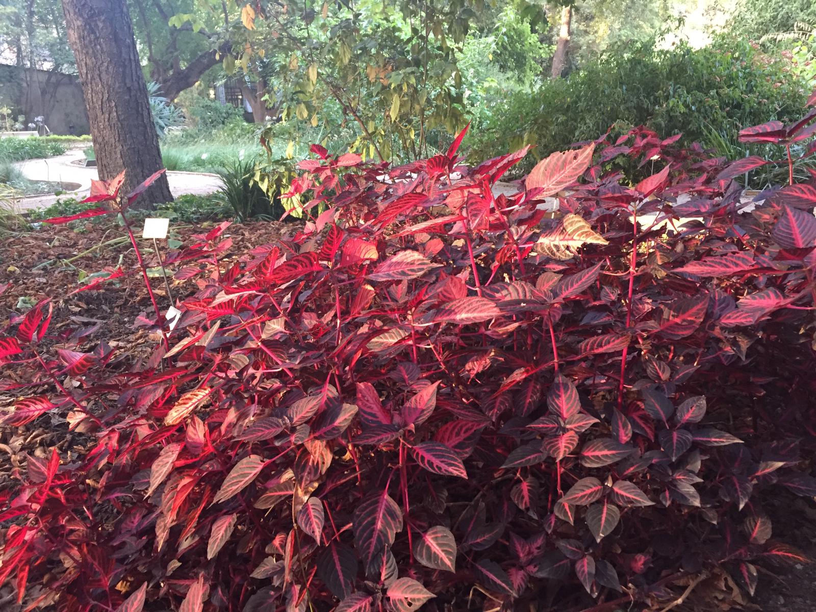
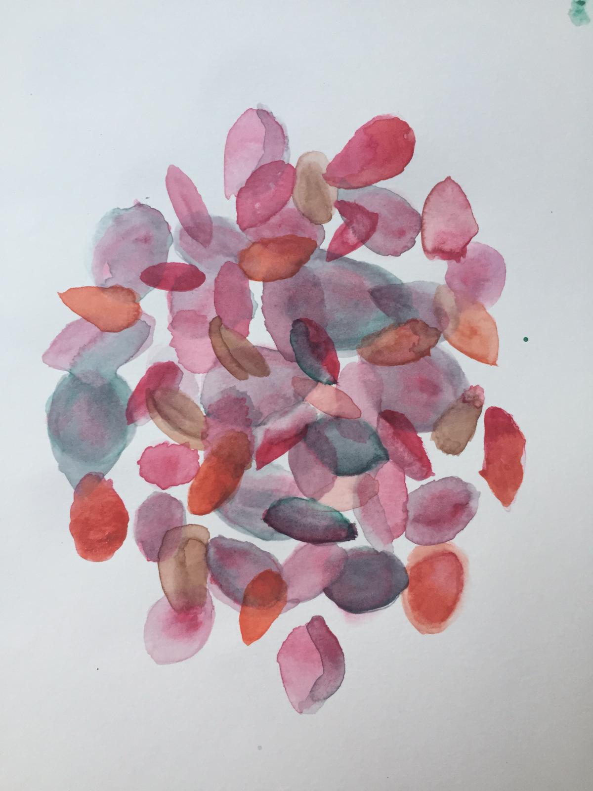
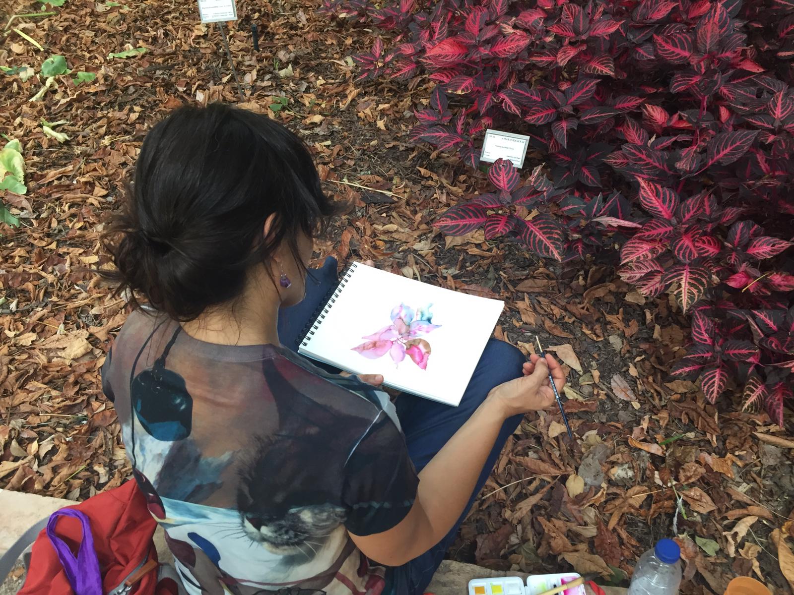
And here we have Patricia also interpreting this wonderful shrub that brings us so much enjoyment.
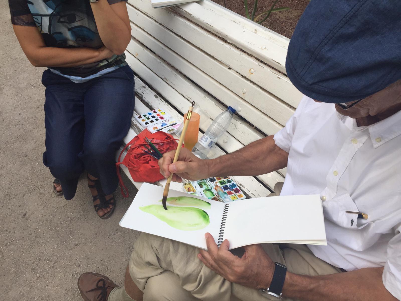
August He's finally loosening up with his brushstrokes and it seems he's getting the hang of it.
The striking bamboos in our garden are a frequent source of inspiration.
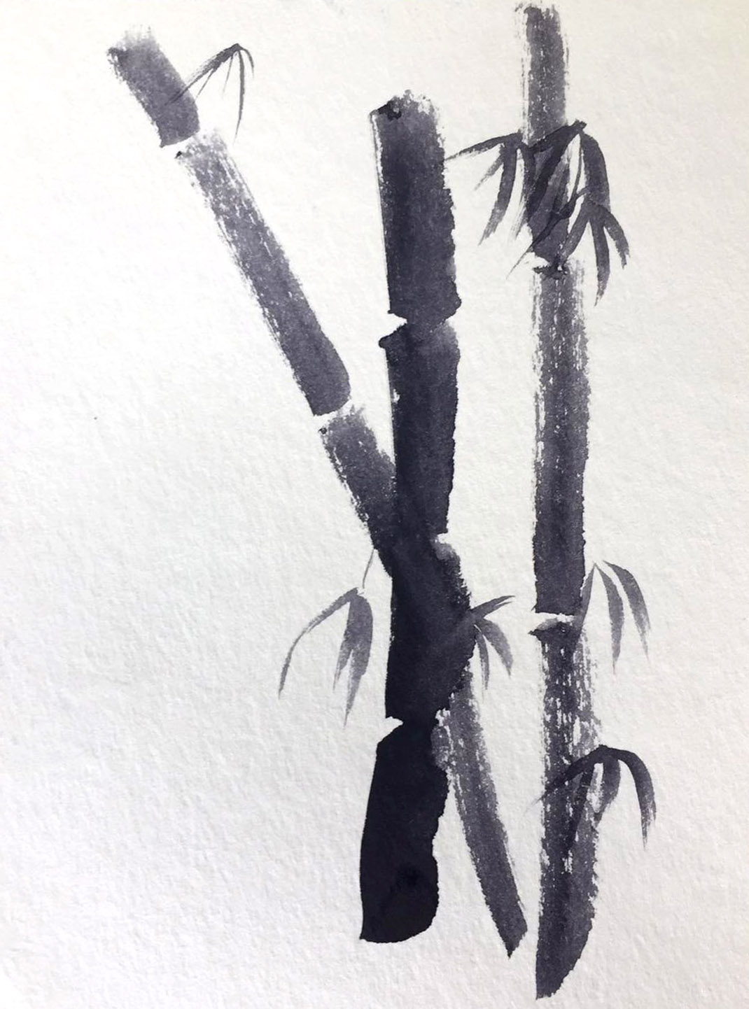

Clara It also delves into the interpretation of bamboos from a more personal perspective, with beautiful chromatism, very beautiful!
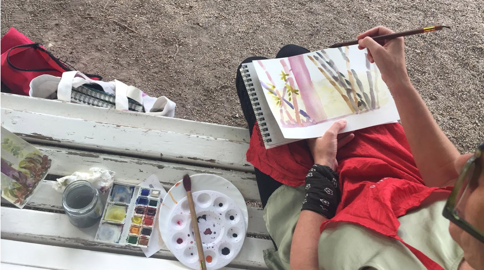
And with this we conclude this journal and this watercolor course in the botanical garden of Valencia.
I hope we meet again soon for more painting experiences as rewarding as this one, or even more so; it has been a pleasure.
You can leave your comments below. Thank you!
See you soon, colleagues!

Carmen Ibarra

It's so lovely to see all this and remember the short time I spent there. Because of Covid, it's been a long time since I've been back. I can't wait to paint with you all again!
Thank you
A wonderful workshop, in an ideal setting to enjoy the beauty of every corner and detail, calmly... and to try to let myself flow with the watercolor... with Carmen accompanying, encouraging and facilitating... I loved the experience, thank you Carmen 😘
I would like to be notified about the next course. Thank you.
It was a wonderful experience, and I certainly learned a lot about watercolor painting from Carmen. The setting was perfect, and it brought back so many childhood memories, making it a fantastic experience that I will definitely repeat sometime soon. Thank you all, and I hope to see you soon, once I've overcome my current health issues. Hugs, Carmen.
What a refreshing setting for painting! What a lovely idea to be able to paint there, and how relaxing it is with your company 😍
Your course is vibrant and luminous. Fresh air and the plant world, water. Watercolors and the sounds of the garden. Cats perhaps….